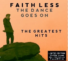
For the feedback on our digipak draft 2 we printed out and showed our target audience what we'd produced and questioned them on what they thought worked well or what didn't. This way we can receive constructive feedback in which we can go on to make improvements so that our digipak works for out target audience.
Front:
The feedback we received from our front cover was mostly positive as they much preferred the font on this than our old draft, also the image works well because it leaves space for the titles to work, they also like that the titles were in different font sizes signifying the importance of each over the other, for example the 'FAITHLESS' is larger than the 'THE DANCE GOES ON' as the artist is the importance. However they thought that the wording on the stick could be phrased better because it needs to be focussed on the exclusive DVD more than the track listing, therefore for our final draft this is what we'll have to change for our front cover on the digipak.
Rear:
We received similar feedback for the rear as they much preferred this draft to the previous, one of the main reasons is that it makes more sense and flows with the front cover well, and they thought that the font work well with the overall piece also and you can tell that we took the font into consideration as we researched and downloaded this particular font (Nevis). However the small print text at the bottom could be worded better as it doesn't quite follow the conventions of a digipak yet, and the twitter logo on the lower right also doesn't follow the conventions therefore we'll have to change these two aspects so that our digipak follows the common conventions.
Inside Right:
For the inside cover we stuck with the idea of having a grid of different images of the chair as it worked well and achieved the abstract feel to it which is what we wanted, although from our feedback previously we've added more variety of shots and colour contrasts to make it more interesting.
Inside Left:
Similar to the previous side we've decided to stick with the grid method here also as it contrasts well with the opposite side, although we've repeated the same images to make it look different to the other and to add this uniqueness to our digipak.
 Centre Panel:
As for the centre panel we've received positive feedback from across the board as it follows all the conventions of a digipak and adds to the continuity of the front and back sides of the digipak, which is an excellent contribution to the overall product.
Evidence Feedback:
Front:
 |
Rear:
We received similar feedback for the rear as they much preferred this draft to the previous, one of the main reasons is that it makes more sense and flows with the front cover well, and they thought that the font work well with the overall piece also and you can tell that we took the font into consideration as we researched and downloaded this particular font (Nevis). However the small print text at the bottom could be worded better as it doesn't quite follow the conventions of a digipak yet, and the twitter logo on the lower right also doesn't follow the conventions therefore we'll have to change these two aspects so that our digipak follows the common conventions.
Inside Right:
For the inside cover we stuck with the idea of having a grid of different images of the chair as it worked well and achieved the abstract feel to it which is what we wanted, although from our feedback previously we've added more variety of shots and colour contrasts to make it more interesting.
Inside Left:
Similar to the previous side we've decided to stick with the grid method here also as it contrasts well with the opposite side, although we've repeated the same images to make it look different to the other and to add this uniqueness to our digipak.
As for the centre panel we've received positive feedback from across the board as it follows all the conventions of a digipak and adds to the continuity of the front and back sides of the digipak, which is an excellent contribution to the overall product.
Evidence Feedback:


No comments:
Post a Comment