This is our audience feedback for the first rough cut we created. the feedback we gained was both positive and negative which is what we were after. One thing missing from this is more feedback from our secondary target audience - this is what we will get when we produce further rough cuts.
Tuesday 28 January 2014
Shoot 6: Planning: 31st January
Following extensive audience research of our first rough cut we are aware of the changes that we need to make. To apply all of these changes this requires us to re-shoot certain sections of the music video. we are therefore planning the shoot before hand as we have done previously to ensure the shoot runs smoothly. Are audience feedback was really helpful to gain an opinion from third party views.
What we plan to shoot:
What we plan to shoot:
- Recreate the bedroom scene eg. long shots, mid shots, steady camera work, a range of framing.
- Digi-pack pictures
- Re-shoot at the graffiti wall to get a continuous shot where the character is sat on the chair and the editing is sped up
- Nightmare scene needs changing
- Recreate the dance section
- Shaky camera shots/zoom shots
- The ending where he potentially confronts his nightmare
Locations:
- Jakes house
- Graffiti Wall
- Train Crossing
- Moors
- Rave Room
Monday 20 January 2014
Audience Research vodcast
Faithless - Insomnia Rough Cut 1
This is our first rough cut we have produced we will be looking to gain feedback on this rough cut then we can improve or change any suggestions if we feel them to be appropriate. We think our rough cut is good however, it can be improved in parts this is what we are hoping to gain back from our audience feedback.
Friday 17 January 2014


Thursday 16 January 2014
Magazine Ad First Drafts
Following my magazine ad research i began to start designing a rough draft for what our magazine advert would look like. following the main conventions i came up with some rough magazine ad ideas. I will then gain feedback and go ahead with the best design.


 With the black font it stands out a lot more in comparison to the white one.

 |
| Mag ad sheet 1 |
 |
| Mag ad sheet 2 |
Above are my first initial ideas for our magazine ad and i have began to design the ones i think would fit best with our audience.
I began with the font which i downloaded from a website called TenbyTwenty this offers users the choice to download a number of different fonts. I thought the font Nevis fitted in similarly to the one are artist uses on their website.
As you can see there is as a similarity between the two which is why i wanted to use this one.
Another font i particularly liked was this dymo font which is similar to the one paramount use for their ident.

Another font i particularly liked was this dymo font which is similar to the one paramount use for their ident.
This is a rough draft of one of my designs.
Obviously this needs some more exposition on the ad but this is my first rough idea.
For the second draft i decided to try out a different font from the website Dafont.

For the second draft i decided to try out a different font from the website Dafont.
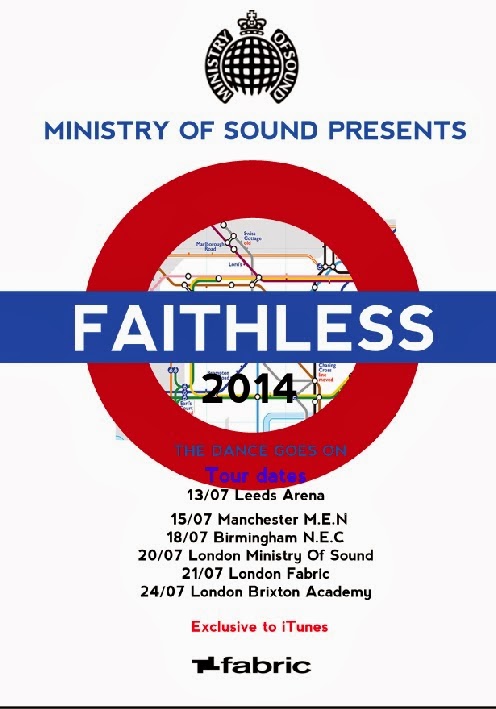
For the second draft we wanted to include tour dates for our act as this is a main convention for magazine ads. I found a number of past tour dates on their website.

One thing i recognised was that our artist does a number of shows rather close together then has a few weeks before his next gigs eg. 6th, 8th, 9th of march then the next gig would be 30th and the 31st. So this is something we are going to include.
As our artist is recognised internationally his gigs are all over the world. However, we want to narrow ours down to Uk tour dates rather than international. As well as playing gigs and concerts our artist plays at festivals also so this may be something we include.

As our artist is recognised internationally his gigs are all over the world. However, we want to narrow ours down to Uk tour dates rather than international. As well as playing gigs and concerts our artist plays at festivals also so this may be something we include.
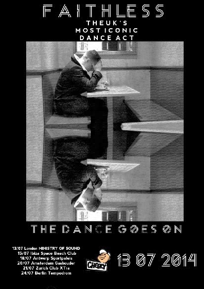
On our sixth shoot we took the pictures we needed for our magazine ad, this meant that we would be able to create a teaser ad as well, the pictures are below.


This is a first draft of a teaser ad.

This is a first draft of a teaser ad.
I do not like this one at all here is another example of a teaser with a new downloaded font.

This is one of our draft teaser ads with different font colours as the white one didn't link in with the back ground image.

Tube station themed mag ad.


Subscribe to:
Posts (Atom)